- Home
- FCHAIN's Logo is 4 years Old - FCHAIN
FCHAIN's Logo is 4 years Old - FCHAIN
Name and logo constitute external attributes of any company. These are the main visual constituents of what we call a brand or a trademark. By these graphic signs, the company is recognized by customers, buyers of goods or services, as well as municipal and state authorities. With the help of logos, advertising specialists promote the brand in the respective markets, position it among competitors and partners, and conduct PR campaigns to create a positive image of the company.
This preamble was not written for no particular reason, but in order to inform our clients and partners about a small but important date for us. In August 2020, our new name and logo will be 4 years old! Yes, four years ago, we decided to rebrand our brand book with a view to expand the range of services and access to international markets. We changed the name of the company from a narrow regional one – CACS (Caspian Accounting and Consulting Services), to a more global and universal one – FCHAIN (Financial Chain Corporation). Immediately a demand arose to create a new logo for the new naming, and it was created and became what you see him now. But, before we tell you about the meanings that are embedded in it, let’s define the basic concepts and remind those who have forgotten what a logo is.
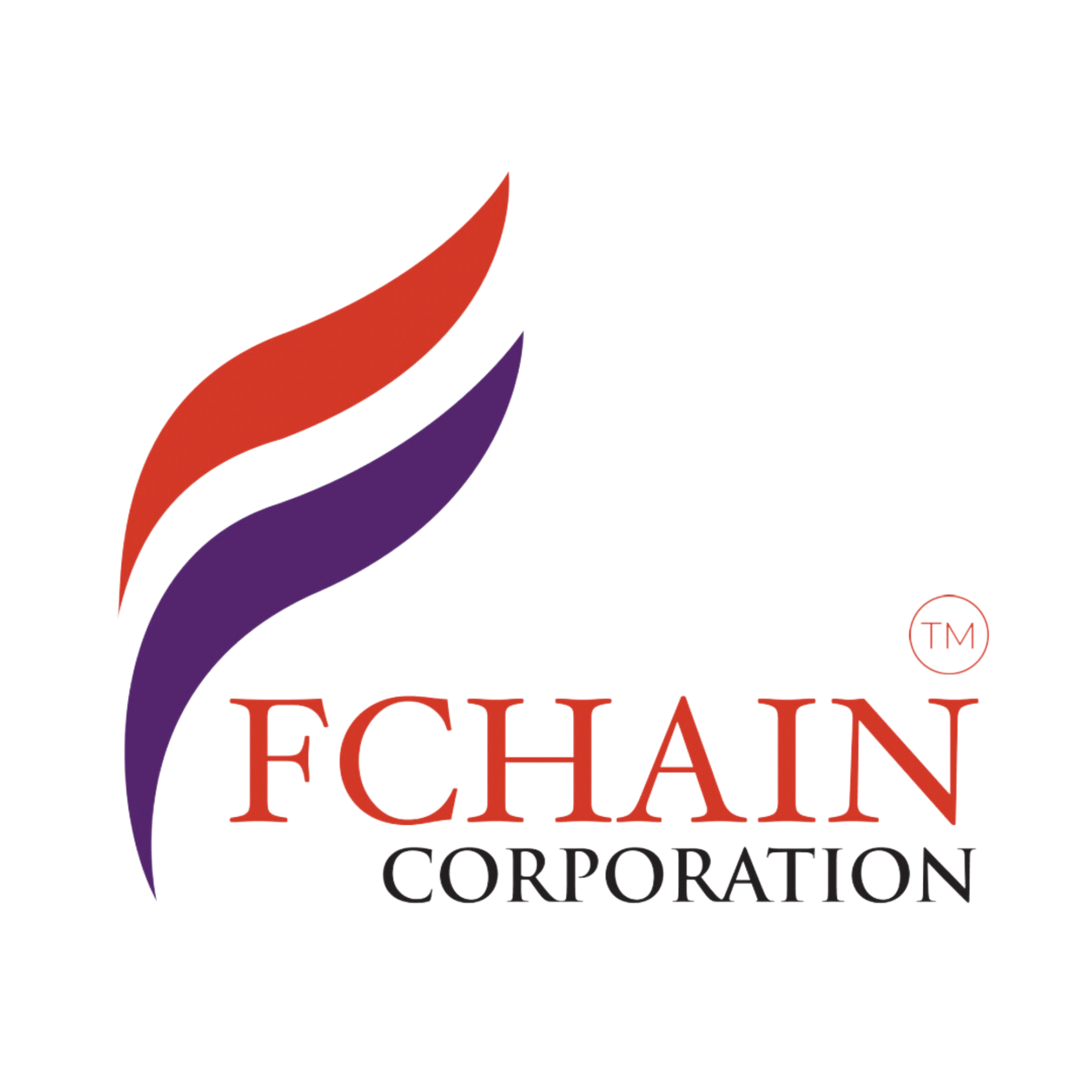
Now about the FCHAIN Corp. logo. in details. The Business Development and Marketing Department in 2016 generated ideas for a possible graphic representation of our logo. As a result, the offer of our employee Tural Sultanahmadi, Business Development Manager, was accepted. After the work of the designers, our employees, partners and clients saw the sign that everyone eventually had become accustomed to.
Both letters and picture, the spelling of the company name and graphic elements, are used in this combined logo. We have already talked about the name, but the meaning of the picture is not immediately clear to everyone and requires an explanation. Yes, the drawing is ambiguous, which is typical for complex businesses, and its meaning is not immediately read.
Some see forks of flame in two elongated petals, which symbolizes fire, one of the basic states of matter without which life on Earth would be impossible! In fact, our specialists “burn at work” like a bonfire! This is how they “warm and give life” to the clients’ business with their high-quality and professional advice and services!
And some see banners fluttering in the wind in our logo. This is also correct and acceptable since our company proudly carries its flags to the financial markets of different countries, like its range of knowledge and services.
But, the colors of our logo are also not random at all! The combination of noble purple and red not only attracts attention, emphasizes the solidity of the company, but also contains a special semantic range.
Purple is a rare color in nature that has always been associated with wisdom, superiority, royal wealth and power. At the same time, calm and majestic. And right there, next to purple, red appears – a color the energy of which is characterized by strength, dynamics, action! It is a popular color of activity, self-confidence and power in modern identity.
Our customers can count on the combination of such strong qualities inherent in the meanings of logo colors when contacting FCHAIN Corp. for services. This is the content originally incorporated into our logo, which is not immediately readable and which is four years old now.
Lala Mammadova,
Business Development Specialist
- Author: FChain Media
Public Relations Manager
Latest news


Consultation
Contact us or find nearest office

